

Descroll
Descroll is an iOS mobile app designed to help Gen Zs form healthier scrolling habits to improve their mental well-being, empowering them to scroll with intent and create a balanced relationship with their device.
Role: UX Researcher, UX / UI Designer
Project Length: 10 Weeks, Feb-Apr 2024
Tools: Figma, Otter.ai, Goodnotes

“One of my lessons from infinite scroll: that optimizing something for ease-of-use does not mean best for the user or humanity.”
— Aza Raskin, Creator of the Infinite Scroll
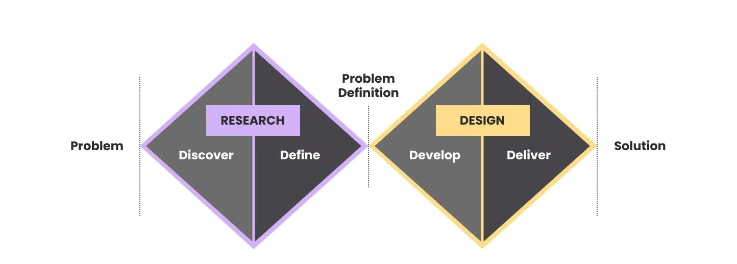
The approach
Double diamond design process
In this project, I utilized the double diamond design process to identify the core problem through research and develop a final digital solution. Leveraging divergent thinking, I explored multiple ideas before converging on the best solutions, guiding the creation of a high-fidelity digital solution aligned with user needs.
The problem
What is infinite scrolling?
Initially intended to provide improved usability, infinite scrolling enables continuous scrolling without the need for refreshing or clicking a "next page" button.¹
However, the use of features like infinite scroll that prioritize engagement over user well-being can have negative effects on mental health, particularly among young users.¹ Psychologists and studies have stated that this pattern of endless scrolling is a compulsive behaviour that negatively impacts mental well-being.

Secondary research
Infinite scrolling’s impact on Gen Zs
Through secondary research, I discovered that Gen Zs lead in spending the most passive amounts of time on social media compared to any other generation.² Furthermore, based on a study surveying 256 Gen Z and Millenials, 85% of respondents believe they have a problem with mindless scrolling, with only 8.2% believing that they have their social media usage under control.³ Additional key findings showed that:
78%
of 30 million Gen Z users surveyed
reported that the app TikTok felt addictive to them⁴
71%
of young adults use Instagram,
with Facebook’s own research showing that it negatively impacts mental health⁵
User interviews
What Gen Zs had to say
To gain deeper insights into the problem, I conducted five interviews with Gen Z individuals (aged 12-27) living in Toronto who regularly use infinite scrolling apps. My objective was to explore their experiences, pain points and motivations around infinite scrolling and apps that implement this feature.

Top apps used

“I feel like TikTok’s the new smoking.”
“[Scrolling] is not beneficial for my well-being or life.”
Top apps used

“I do sleep later because of [scrolling]...[I] go on TikTok and then it's 2am.”

Top apps used

“I feel resentful, like why am I watching this?”
“I feel like I have a shorter attention span.”

Top apps used

“I realized scrolling apps feed a lot into my anxiety and overthinking, and it wasn't serving me in any way.”

Top apps used

“It's so simple to put it away, but if I want to squeeze in screen time I get less sleep and then am less productive and less attentive.”
Affinity mapping
Identifying common themes
Based on the relevancy to the problem, I identified the top 3 themes that emerged from interviews:
🌱 Well-being is compromised
Despite finding scrolling apps like TikTok relaxing, Gen Zs in Toronto feel their well-being suffers due to excessive scrolling. They feel that these habits lead to anxiety, detachment from reality, feelings of insecurity, and sleep disruption.
✋ Challenges in stopping
Gen Zs in Toronto feel a lack of control over their scrolling habits, finding it challenging to stop scrolling when there is nothing pushing them to stop or when engaging with enjoyable content. This often results in feelings of guilt and resentment.
⏱️ Prevention tools are ineffective
Despite taking preventative measures in hopes to limit their scrolling, including setting timers on their devices and establishing goals, Gen Zs in Toronto often find themselves bypassing or ignoring these measures.
Key takeaway: 🌱 Well-being
Despite finding scrolling apps like TikTok relaxing and a helpful way to decompress, many Gen Zs in Toronto feel their well-being suffers due to their excessive scrolling habits. They feel that these habits lead to negative emotions like anxiety and detachment from reality, fuels their insecurities, and disrupts their sleep.
Design question
How might we empower Gen Zs in Toronto to improve their mobile scrolling habits to benefit their well-being & mental health?
Persona & experience mapping
Establishing the target user
Drawing from the secondary and primary research conducted, I created a persona named Priya Jain. She embodies the core theme and insight, allowing us to focus on the well-being of Gen Zs affected by scrolling and helping us clearly define our target audience.


Task selection & task flow
Defining functionality
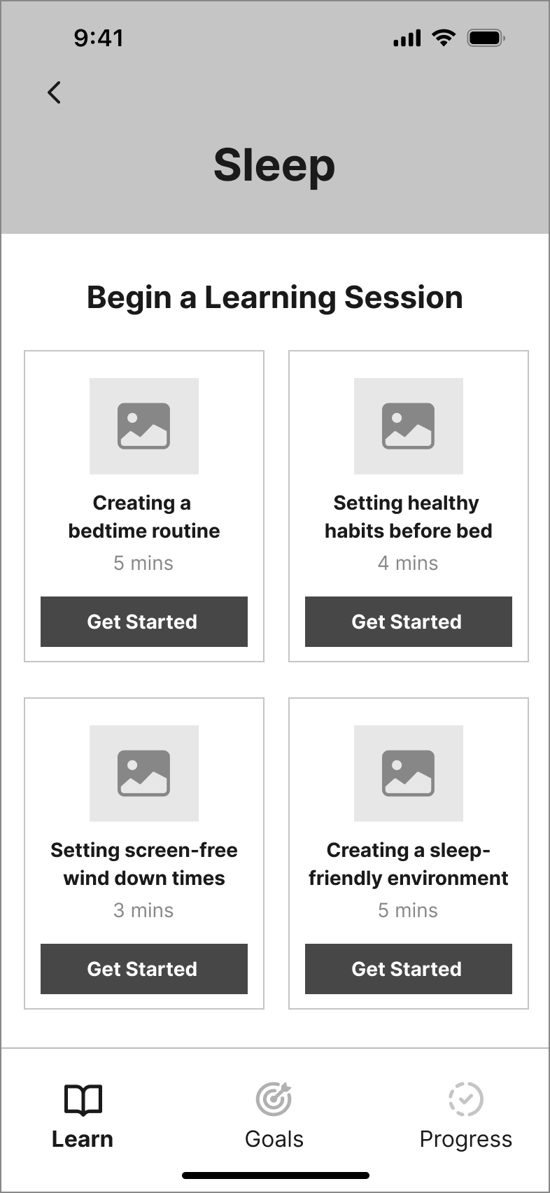
Regarding Priya's goal to improve her scrolling habits for better mental well-being, I created a set of 24 user stories under 5 key epics to help me identify the essential functionality required to deliver value to Gen Z users through a mobile solution. Among these epics, Completing a Learning Session emerged as the central focus.
By increasing mindfulness around scrolling-related issues through education and guiding her in setting goals, this epic effectively tackles Priya’s concerns.
After analyzing the 11 user stories related to Completing a Learning Session, I identified the key tasks that align with these stories and created a task flow diagram that visually depicts the steps that Priya would take to complete the task at hand:
Ideation
Sketching & wireframing
Drawing from UI inspiration, I sketched potential concepts for each screen, incorporating familiar interactions for Gen Z users. These exploratory sketches were fine-tuned into solution sketches by refining sketch variations that align best with Priya’s preferences:
Exploratory Sketches
Education & Tips Screen
Variation 1
Variation 2
Variation 3
Refined Solution Sketch
Education & Tips Screen
Exploratory Sketches
Completion & Progress Screen
Variation 1
Variation 2
Variation 3
Refined Solution Sketches
Completion & Progress Screen
Based on my solution sketches, I then translated my paper sketches into mid-fi greyscale digital wireframes:
Learning

Selected Problem
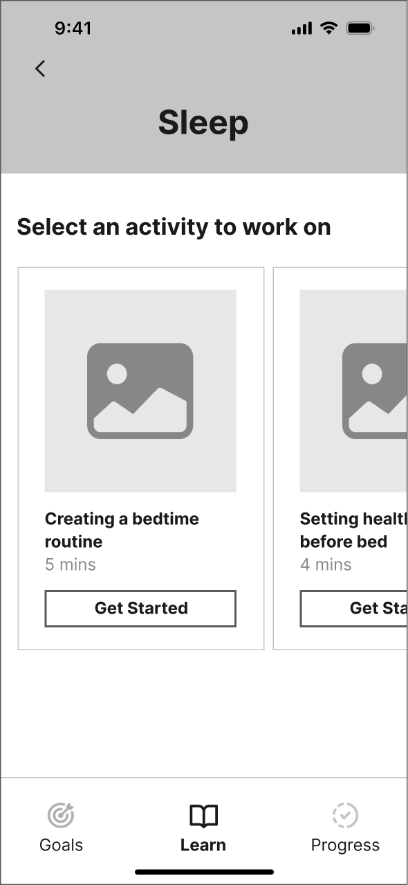
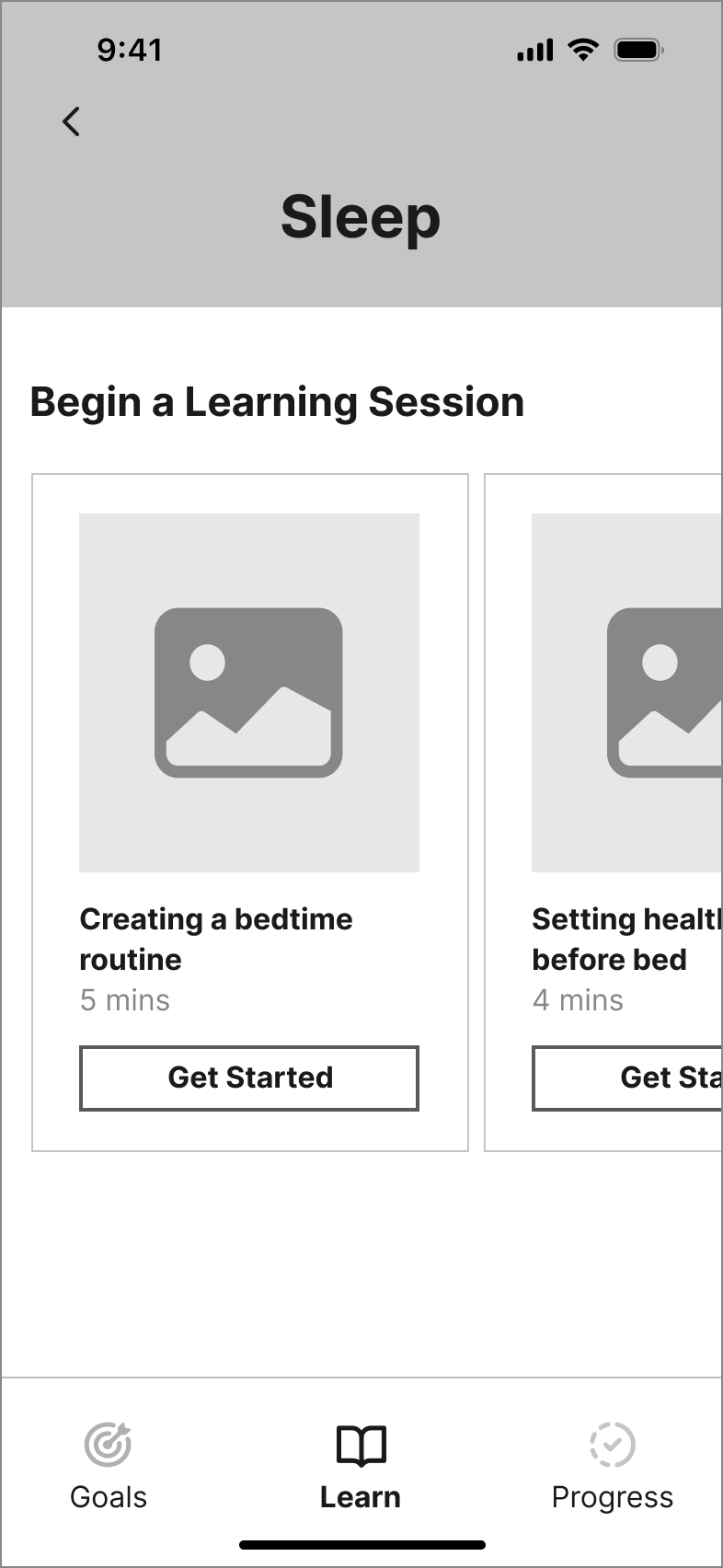
Selected Activity

Education & Tips

Select a Goal

Select a Duration
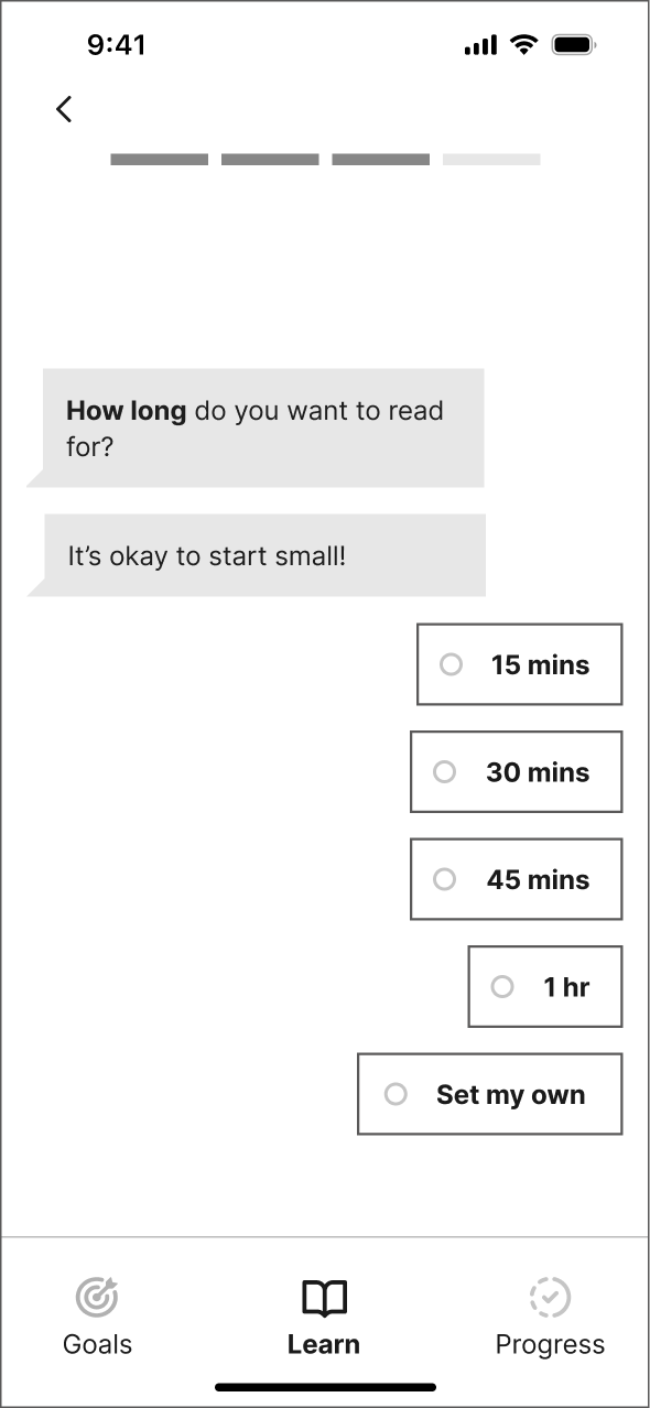
Select a Frequency

Completion & Progress

Two rounds of usability testing
Getting feedback from users
From the wireframes, I developed an initial interactive greyscale prototype. I then conducted two rounds of usability testing, with five participants in each round. The objective was to gather real-time feedback on the user experience of completing a learning session tailored to Priya's goal of enhancing her scrolling habits for better mental health.
Round 1: Key feedback
Violation of Recognition over Recall
Testers noted the absence of clear confirmation or reminders after selecting a goal, its duration, and frequency. This forces users to remember their input during the goal creation process, which goes against the heuristic of "recognition over recall."
V1
V2
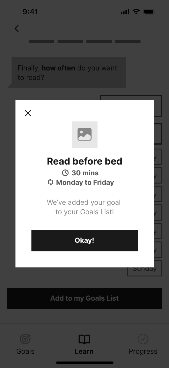
Added a modal to confirm goal set by user before proceeding to next screen
Confusion around progress
Testers found the progress meter confusing. One tester mistook it for representing the learning session instead of overall progress towards mastering "sleep". This prompted me to rethink how I could better present Priya's progress and motivate her to achieve her goals.
V1
V2
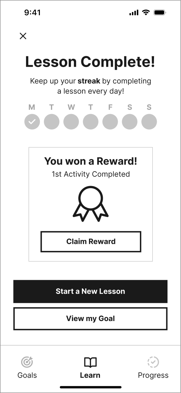
Replaced progress bar with a streak feature to clarify user goals and create motivation
Round 2: Key feedback
Difficulty in selecting frequency
Four out of five testers found the day picker, included in selecting a custom goal frequency, to occupy too much screen space and offer too many selections. This led to user annoyance when choosing a custom frequency since it required additional effort, hindering the goal-setting process.
V2
Final

Replaced with a horizontal day picker to reduce user effort and the space occupied
Limitation in a horizontal layout
One tester noted that the horizontal carousel layout of learning sessions required more recall from users since only 1.5 cards are visible at a time on the screen. This prompted me to reassess the current layout, especially if more learning session cards are added in the future.
V2
Final
Implemented a vertical view of cards to increase visibility and reduce user recall
Mid-fidelity prototype
Implementing revisions

From these two rounds of testing, I incorporated all revisions into a final mid-fidelity prototype.
Moodboarding & colours
Defining the brand identity
After defining the key product functionality, I established my app's brand identity by selecting six keywords reflecting a motivating and friendly tone aligned with Priya’s preferences.
Playful
Motivating
Calming
Welcoming
Friendly
Simple
These keywords guided the creation of a moodboard, visually capturing these words through imagery, textures, and illustrations to further define my brand identity.
I chose purple as my primary brand colour since it conveys emotions of calmness, optimism and relaxation, relating back to my brand keywords. I then explored color combinations with this purple, ultimately choosing to pair it with yellow. This combination best represents the brand's values and keywords: yellow signifies friendliness and happiness, while purple conveys calmness, creating a balanced and playful aesthetic.

Wordmark
Naming the brand
In naming the app, I brainstormed six options and consulted my peers to gauge their preferences. "Descroll" emerged as the unanimous favourite for its quick and catchy name, effectively communicating the goal of improving scrolling habits in a succinct manner.
I then focused on creating a wordmark to uniquely represent my brand identity. Drawing inspiration from wordmarks that use geometric sans serif typefaces for a simple yet inviting feel, I sketched wordmark iterations for my app that convey a scrolling effect. I then digitalized each sketch to represent them as they would appear to the user, also testing typefaces beyond geometric styles during this process.
The second wordmark variation stood out as the clear winner after peer review because of its clean yet playful design and its ability to illustrate the act of scrolling. It was chosen as the final wordmark, and I applied brand colours to the final version.


Brand identity
Descroll’s brand palette
I developed a final brand palette that presents a holistic view of the brand, aiming to relate to Gen Zs like Priya who want to improve their scrolling habits to benefit their mental health.
Brand character
To define Descroll’s identity further, I created a simple yet playful character to serve as a versatile element for illustrations, promoting a consistent and engaging tone throughout the app.
App icon
Inspired by brands like Duolingo and My Possible Self, which integrate mascots into their app icons, I included Descroll’s character in the final app icon design - its colour gradient complements the app's tone, creating a calming and playful effect that aligns with Descroll's brand identity.
Hi-fidelity prototype
Crafting the final product
After defining Descroll’s brand and colours, I revisited UI inspiration to consider high-fidelity visual design elements for the prototype. From there, I experimented with injecting Descroll’s brand colours to explore the app's visual identity direction.
Considering peer feedback and Descroll’s brand tone, I decided to integrate a purple-to-yellow gradient into the final hi-fi colour scheme to add depth and engagement.
As part of final hi-fi adjustments, I revised the design layout of the first Learning Screen in response to feedback to improve usability and user engagement early on in the task flow.
UI library
Atomic design system
To maintain UI consistency across all screens and to streamline the development of Descroll, I created a UI library using Atomic Design Methodology. This library consists of the elements and components used across the digital product, categorized into Foundations (Grids & Spacing, Typography, Colour & Accessibility), Atoms, Molecules, Organisms, Templates, and Pages.
Colour accessibility
In choosing a colour palette, I ensured text colours adhered to Web Content Accessibility Guidelines (WCAG) 2.1. This involved selecting background-to-text colour combinations that are both AA and AAA compliant, ensuring optimal readability and accessibility standards.
Marketing
Promoting Descroll
After finalizing Descroll’s hi-fi design, I set out to craft a responsive website experience on both desktop and mobile viewports that promotes the mobile app and communicates the value proposition to prospective users.
The design incorporates a tone consistent with the app and elements tailored to resonate with Priya's motivation to enhance her scrolling habits for improved mental well-being, encouraging her to download Descroll.

Reflection
Descroll’s impact
The issue of excessive scrolling, especially among young people, is undeniably complex. While existing apps focus on short-term solutions like timers and screen blocking, I aimed to develop a more comprehensive solution that tackles the root of the problem by focusing on the unlearning of negative scrolling habits. Descroll aims to empower Gen Zs by motivating them to take control of their scrolling habits, encouraging lasting behavioural change rather than just prevention.
To explore potential future outcomes of launching Descroll and fully consider its impact, I utilized Artefact's Tarot Cards of Tech. These cards help to anticipate both unintended consequences and opportunities for positive change resulting from a product.

If two friends use your product, how could it enhance or detract from their relationship?
Based on user interviews and primary research, I found that Gen Zs highly value their time on infinite scrolling apps when used purposefully - they enjoy staying connected with friends by sharing content and messaging. Descroll is flexible to users' preferences, whether they aim to develop healthier scrolling habits or reduce overall app usage. If used to enhance scrolling habits, Descroll may have little impact on a friendship since users would engage more intentionally. On the other hand, reducing app time could potentially affect relationships, since less usage may lead to decreased interaction between friends.
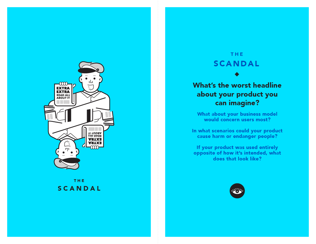
What’s the worst headline about your product you can imagine?
“Descroll’s Double-Standard: New Anti-Scrolling App Uses Social Media for Promotion”
For marketing purposes, Descroll would use social media to promote the app as a tool for improving scrolling habits. However, this could be seen as being part of the problem since Descroll aims to improve negative effects of social media scrolling. To address this, Descroll could use its social media platforms to encourage Gen Zs to take breaks. For example, a video or image could prompt users to consider if they’ve taken a break from scrolling, supported by copy like “Need help managing your scrolling habits?” with a link to download the app.
Conclusion
Key learnings & next steps
⭐ My takeaways
Reflecting on the project as a whole, I've come to understand and embrace the many facets of human-centred design and what designing for users truly means. Here are a few key takeaways:
Embracing the iterative nature of the Double Diamond Design Process, continually evolving based on user testing and feedback.
Always staying problem-oriented rather than solution-driven by prioritizing insights from gathered research to inform design decisions aligned with user needs.
Recognizing the importance of gathering strong data by asking the right interview questions to delve deeper into the problem space.
Utilizing personas in every stage of the design process to inform and guide design decisions effectively.
🤔 What’s next?
The development of Descroll doesn’t stop here! There are ongoing considerations, iterations, testing, and improvements to be made to both the task flow and the product as a whole. Here are a few areas I’d like to focus on in the near future:
Enhance Learning Session engagement: Explore incorporating more interaction or gamification (e.g., quizzes questions throughout the learning session) for active learning among Gen Zs, enhancing retention and adding some fun to the process.
Refine Completion & Progress screen to increase user motivation: Celebrate milestones with positive news instead of a streak count (e.g., "You’ve completed 3 days in a row!"). Conducting user testing will provide insights into whether this change does in fact improve user motivation.
Build out the functionality of the Goals List & Progress locations: Develop the remaining app features to complete the user experience, and iterate on the design through user testing for continuous improvement.
